
Interface Design
As an avid designer and analyst, I feel that understanding and engaging with both the user’s experience and interface helps strengthen the quality of both components. Over the course of my time as a student and intern, I was introduced to sketching and wireframing using tools such as Balsamiq, Figma, and Adobe XD as a means to develop an intuitive and satisfying digital interface.

While working as an intern for Quadio Media in the Summer of 2019, I had the opportunity to review wireframes created by members of their UI Dev Team.
Quadio - UI Design Edits
One of my main projects as an intern at Quadio, an upcoming free streaming service created specifically for college students, was to make sure that the product was not alienating certain groups of musicians, such as college a cappella groups or bands. Though I was not taken on as a UI intern specifically, I asked my supervisors for the opportunity to get involved with their UI/ UX endeavors, as I felt the experience I would get at a startup would be invaluable for my future. I was tasked with taking an existing wireframe made in Adobe XD that represented a page for a group of musicians, and creating different possible layouts to facilitate showing both present and past members of a group. In this case, the argument made by my team for this feature was that many college music groups and clubs have seniors that graduate every semester, which makes managing a list of member accounts associated with any given group much harder and more confusing. This feature would have allowed those groups to simply mark graduated seniors as previous members, and would have allowed those members to still be associated with that music group without showing as part of the current lineup.

Large Toggle Options
This option replaced a piece of text that read “Member List” with a large, easily visible toggle for choosing between the respective member lists. Since the toggle style is consistent with the rest of the web application’s toggles, I believed that this was the most salient and intuitive choice, but its downsides are that it takes up a large portion of the screen all on its own, which for some may be less aesthetically pleasing. When variating on this idea, I found this format of toggling to make the most sense visually.
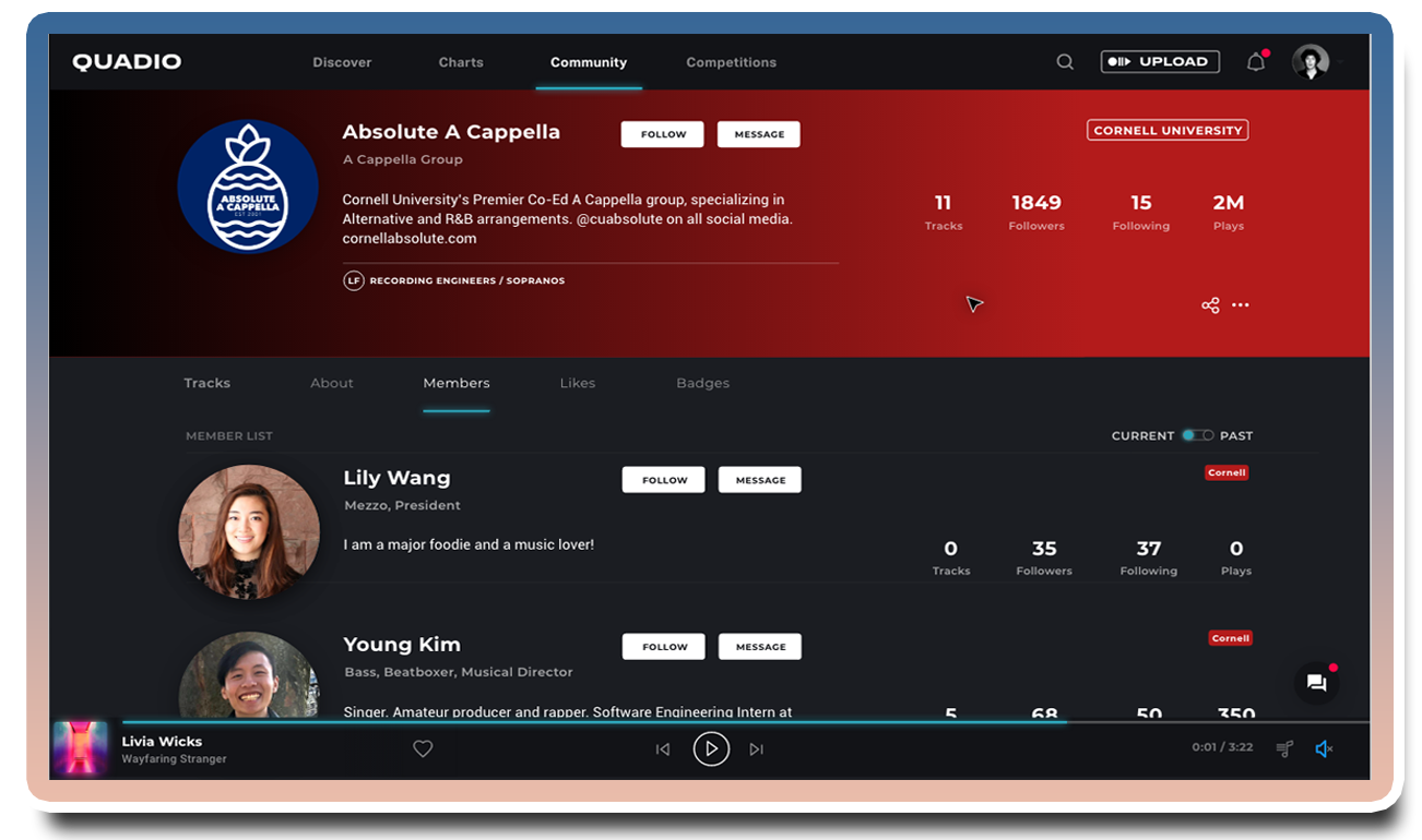
Small Toggle Options
This option uses a convention seen elsewhere in the draft of the web application that I was accessing. It places a smaller, more secondary toggle that is situated opposite a set of text so as to imply that the user can flip between options related to that text. In this case, that text is the member list that got replaced in our first option. Shown above is a version I created that uses a switch-based design to go between past and current members. Not shown are three to four other variants of different types of toggles that were determined to be less effective as a more minimal design.
